
(august 31st- september 8th)
The two new works I’ve made this week (since my last Jeena meeting) have taken me longer to make but i think theyre more considered as a result. I think I’ve finished my ‘make a million paintings to work through my big ideas until i find a thing that works’ phase, and I’ve found a thing that works for me. I was looking at scale and density in my compositions, and looking at when to deploy big colour and when to use black and white in my colour choices.
this is the work i made at the end of last week that jeena and i agreed was an effective one to continue along the line of;

Based off of this one, I made one of the exact same composition with a few altercations.

because there was less contrast in the border colours and there was no variation in box size or scale of the diamonds in the inner composition I overall think this is a less successful composition. I still think its interesting but I don’t think it holds the same properties that the first one does.
After this I rediscovered Flesh Dozer’s (Jess Johnson’s) work and fell in love with it again. (in my excitement after going through her catalogue again i tried to write down what brought me so much joy about them)
What is it about her work that tickles my brain so good?
- Density
- Repetition
- Grandeur (ritual/religious experience)
- Scale
- An integration of text that feels natural instead of tacky
- Structured compositions
- Absurdist subject matter
- Her influences are all things I enjoy a lot; the occult, ritualism, science fiction, games, dnd, etc. IN HER WEBSITE SHE TALKS ABOUT THEORIES OF CONSCIOUSNESS !!!!
After spending a significant amount of time looking at her work I boiled down somethings about it that I loved and could implement in my work.
Her work pushes density to an extreme – all of her compositions are so dense and gives your eye a lot to digest, but she does a good job at contrasting this with the things she wants you to know are more important and changes the scale in them and gives small areas of flat colour so things can breathe.
She also uses colour like a designer would – one or two main colours as the overarching first impression, but with smaller areas of other colours scattered through. She uses a lot of neutrals to make her colours stand out more. All of her works have a border on them, but 9/10 times that border is disrupted in some way, which i also really like.
Here is the first work i made after looking at her more.

a few things changed in this painting. first of all this was the first painting I’ve done when I had my hands on a ruler, which meant I could get relatively straight lines without having to tape it (I hate the way the tape changes the texture of the paper when its pulled off) and without having to trace around another piece of paper, which is why I can get some new interesting shapes. I fell in love with these elongated diamonds. I also wanted to keep my checker but try smaller, and I thought in the diamonds is a place I haven’t put it before. I brought back the yellow purple border, but at a smaller scale, again to add to density. its asymmetrical which i really like, but if I had more foresight when i was painting it, I would have flipped the border, so the yellow would touch the blue and the purple would touch the orange. Because the orange touches the yellow that detail gets lost in the border which makes it feel wonky and clumsy. what I do like about this composition is how the checkered diamonds break the border, and I like the middle red and blue grid composition, which I’m calling ‘the mesh grid’ that I stole from Manfred Kuttner. I don’t like the red and blue, but it’ll be something I keep using.
Now that I’ve just ripped it apart, i really do like the overall energy of this painting. It’s giving me 90s New School Tattoo/ Hot rods and flames energy (hence the name)
This is the painting i’ve just finished:
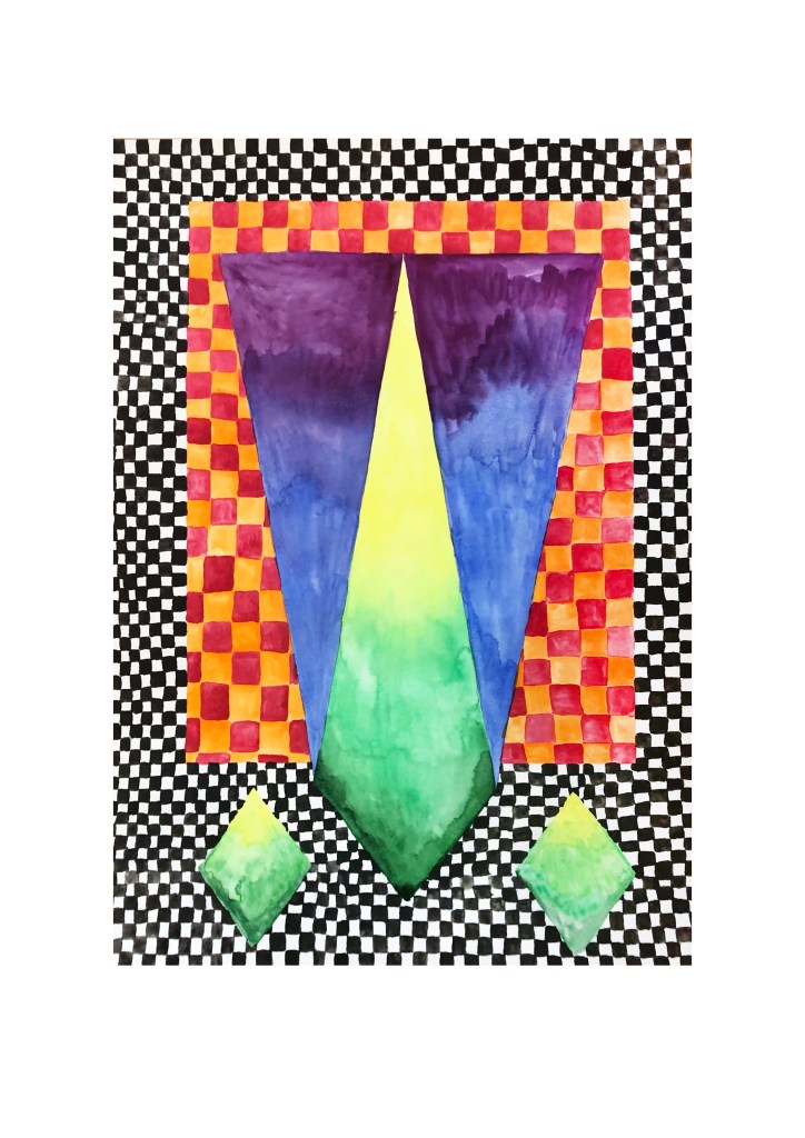
what I really like about this one is the contrast between the tiny checks and the saturated orange and warm red. Overall I’m really happy with the colour choices in this work. I like the way that the smaller checks adds contrast to the scale of the main green/yellow diamond and i like the way the main diamond and the smaller ones talk to each other.
What lets this painting down is the poor execution of the gradients. while the yellow to green feels painterly, the blue and purple is just clumsy. I went to look at how Johnson does gradients, and she uses a series of stripes of colour that sit next to each other, so I’m going to try that in the next work to clean it up and help make it feel more polished.
